
The UISegmentedControl provided by UIKit is a ubiquitous control. However, when it comes to customizing this control, it can get pretty tricky. So I’m going to try to explain how this widget can be styled to better match your app by walking through a few different customizations.
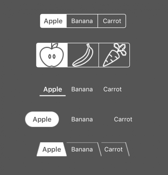
The image below shows the different styles we will build.
Setup
Let’s start by setting up a swift playground. Since we’re going to be creating and comparing multiple UISegmentedControls, I’m thinking a view controller with a stack view will be great for handling the layout.
import UIKit
import PlaygroundSupport

//===========================================
// MARK: StackViewController
//===========================================
class StackViewController : UIViewController {
    override func loadView() {
        let view = UIView()
        view.backgroundColor = .darkGray
        self.view = view

        let stackView = UIStackView(arrangedSubviews: [])
        view.addSubview(stackView)

        stackView.distribution = .equalSpacing
        stackView.alignment = .center
        stackView.axis = .vertical
        stackView.spacing = 32

        stackView.translatesAutoresizingMaskIntoConstraints = false
        NSLayoutConstraint.activate([
            stackView.topAnchor.constraint(equalTo: view.topAnchor, constant: 32),
            stackView.leadingAnchor.constraint(equalTo: view.leadingAnchor),
            stackView.trailingAnchor.constraint(equalTo: view.trailingAnchor)
            ])
    }
}

PlaygroundPage.current.liveView = StackViewController()
StackViewController will be a simple view controller. All we are going to do is set a background color and set up a stack view. The stack view provides an easy way to automatically stack the example controls with adequate spacing.
The goal now is to inject the UISegmentedControl views that we are going to be testing. Let’s define a protocol StackedViewsProvider that can provide these view.
//===========================================
// MARK: StackedViewsProvider
//===========================================
protocol StackedViewsProvider {
    var views: [UIView] { get }
}

class SegmentedControlStackedViewsProvider: StackedViewsProvider {
    let items = ["Apple", "Banana", "Carrot"]

    lazy var views: [UIView] = {
        return [
            createView(items: items)
        ]
    }()

    private func createView(items: [String]) -> UIView {
        let segmentedControl = UISegmentedControl(items: items)
        segmentedControl.tintColor = .white
        segmentedControl.selectedSegmentIndex = 0

        return segmentedControl
    }
}
The protocol only contains one variable, an array of views that the stack view will use.
Next, we create a class that conforms to the protocol and will create UISegmentedControl views. Here the views var is marked lazy. In this way, we can defer creation until the StackedViewController needs them.
The private function does the actual work of creating the first segmented control. This one is just the very basic segmented control with a white tint color, and we programmatically set the first item to be selected. You will usually want to set the tint color to match the design of the app. Also, setting a selected segment index to start with is often a good idea unless you intend for the elements to act as buttons (you can use the isMomentary member variable for that).
We still need to inject this into the StackedViewController. Add these lines to the top of the controller.
let stackedViewsProvider: StackedViewsProvider

init(stackedViewsProvider: StackedViewsProvider) {
    self.stackedViewsProvider = stackedViewsProvider
    super.init(nibName: nil, bundle: nil)
}

required init?(coder aDecoder: NSCoder) {
    fatalError("init(coder:) has not been implemented")
}
First, we create a member variable to hold the stackedViewsProvider. Then create an initializer to inject it.
Now that we created a custom initializer, we must also implement the required initializer. However, since we will not be using it, we can just error here.
Now we need to use this new initializer. At the bottom of the file where the controller is created, replace that line with these two.
let stackedViewsProvider = SegmentedControlStackedViewsProvider()
PlaygroundPage.current.liveView = StackViewController(stackedViewsProvider: stackedViewsProvider)
Finally, let’s use these view in the stack view. Replace the line where the stack view is created with this:
let stackView = UIStackView(arrangedSubviews: stackedViewsProvider.views)
You should now see your first UISegmentedControl!
Simple customizations
We have already done the most basic customizations: setting tint color and setting selected index. I have also previously mentioned that you can make the segments act as buttons with the isMomentary flag.
Width
Another useful flag is apportionsSegmentWidthsByContent. Normally, all of the segments in the segmentedControl are equal in width. That may be a good default behavior, especially when constraining the leading trailing edges of the segmented control to its super view. However, it can be desirable to have the segments have a tighter fit around their contents. To get that behavior, we can just set apportionsSegmentWidthsByContent = true. It is also worth noting that it is possible to set a per segment width.
At the bottom of createView(items:) but before the return, add this line:
segmentedControl.apportionsSegmentWidthsByContent = true
Font
Another nice feature is to set the selected segment’s title to be bold and a little more substantial. For example:
segmentedControl.setTitleTextAttributes([NSAttributedStringKey.font: UIFont.preferredFont(forTextStyle: .headline)], for: .selected)
This will set the title to have the preferred font for headline style when the segment is selected. This makes the selected item stand out even more. This might be a little much, in some cases just bold system font might be more appropriate.
This also has the side effect of animating between bold and regular text when a segment is selected and highlighted. In other words, if you select a segment (tap it) and the also highlight it (press and hold) you will see it animate. Normally this would not happen. This would be nice feedback to the user if you were going to refresh or do some action when the segment is pressed.
This effect may be undesirable, however. In that case, you might expect that you can assign the font to the [.selected, .highlighted] control state. Unfortunately, that does not work here. 😓 However, we are not lost just yet. We can add the font to the .highlighted control state, and that does work. Of course, that also adds that font to all .highlighted segments which is kind of nice.
At the bottom of createView(items:) but before the return, add these lines:
segmentedControl.setTitleTextAttributes([NSAttributedStringKey.font: UIFont.preferredFont(forTextStyle: .headline)], for: .selected)
segmentedControl.setTitleTextAttributes([NSAttributedStringKey.font: UIFont.preferredFont(forTextStyle: .headline)], for: .highlighted)
Builder
We have several options now that can be applied to our segmented controls. Usually, within a single application, you will want to pick some defaults and stick with it. We will not want to copy and paste all that setup. The containing view or view controller probably doesn’t care much about these details either. Therefore, it should make sense to extract these things into a separate builder class. Add the following code to the top of the file.
//===========================================
// MARK: Segmented Control Builder
//===========================================
struct SegmentedControlBuilder {
    var boldStates: [UIControlState] = [.selected, .highlighted]
    var boldFont = UIFont.boldSystemFont(ofSize: 14)
    var tintColor = UIColor.white
    var apportionsSegmentWidthsByContent = true

    func makeSegmentedControl(items: [String]) -> UISegmentedControl {
        let segmentedControl = UISegmentedControl(items: items)

        segmentedControl.apportionsSegmentWidthsByContent = apportionsSegmentWidthsByContent
        segmentedControl.tintColor = tintColor
        segmentedControl.selectedSegmentIndex = 0

        boldStates
            .forEach { (state: UIControlState) in
                let attributes = [NSAttributedStringKey.font: boldFont]
                segmentedControl.setTitleTextAttributes(attributes, for: state)
        }

        return segmentedControl
    }
}
This struct holds some member variables that can be used to customize the segmented control. The first two variables are related to the font customization. I chose to use the “bold” font for .selected and .highlighted control states, but you can change these defaults to fit your preference. The tintColor property can be chosen to fit the theme of the app and apportionsSegmentWidthsByContent can be set based on the intended layout. Since the content in this demo is centered, I chose to set this to true.
Now we can use this builder by replacing the createView method in our StackedViewsProvider.
private func createView(items: [String]) -> UIView {
    let builder = SegmentedControlBuilder()
    return builder.makeSegmentedControl(items: items)
}
At this point, it doesn’t seem like we’ve done a whole lot of customizing. Toggling a few properties might seem like no big deal. But, what we have done is a start to build up a base that we can add customizations to. This SegmentedControlBuilder is going to help a lot in the long run and keep the code sane.
Icons
Before we start digging into the more advanced customizations, let’s take a look at icons. Icons can dramatically change the feel of the control with little effort. So far we have used Strings to define our segment titles. You might have noticed that the UISegmentedControl initializer takes an array of Any. The documentation says that we can pass an array of either String of UIImage.
First, let’s add some images to the resources. I grabbed these from icons8.com.
Now we need to update our API to allow images. Let’s start with the Builder. Replace the makeSegmentedControl method with the following.
func makeSegmentedControl(items: [UIImage]) -> UISegmentedControl {
    let segmentedControl = UISegmentedControl(items: items)
    build(segmentedControl: segmentedControl)
    return segmentedControl
}

func makeSegmentedControl(items: [String]) -> UISegmentedControl {
    let segmentedControl = UISegmentedControl(items: items)
    build(segmentedControl: segmentedControl)
    return segmentedControl
}

func build(segmentedControl: UISegmentedControl) {
    segmentedControl.apportionsSegmentWidthsByContent = apportionsSegmentWidthsByContent
    segmentedControl.tintColor = tintColor
    segmentedControl.selectedSegmentIndex = 0

    boldStates
        .forEach { (state: UIControlState) in
            let attributes = [NSAttributedStringKey.font: boldFont]
            segmentedControl.setTitleTextAttributes(attributes, for: state)
    }
}
We keep the type safety of our API for making new segmented controls by adding an overload that takes an array of UIImage elements. Then we pass that segmented control to the build function. This build function remains a public API so we can build up any already created segmented controls. This is especially useful if you want all your controls to look the same way; you can pass the appearance proxy to the build function.
To use this in the demo app, we need to add a similar overload in UISegmentedControlStackedViewsProvider.
private func createView(items: [UIImage]) -> UIView {
    let builder = SegmentedControlBuilder()
    return builder.makeSegmentedControl(items: items)
}
Then we just need to add a call to our views array.
lazy var views: [UIView] = {
    return [
        createView(items: items),
        createView(items: items.map { UIImage(named: $0)! })
    ]
}()
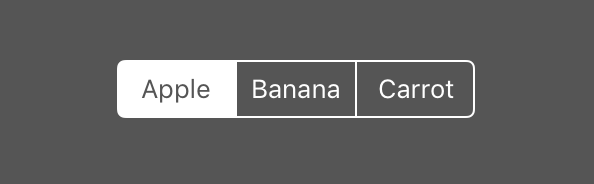
The items [“Apple”, “Banana”, “Carrot”] are mapped into UIImage assets with the same name. Make sure you added those assets and that they are named correctly.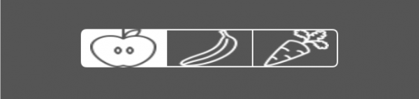
You should see something like the image above. Unfortunately, that’s not quite right; the icons are squashed! This doesn’t just work as you would expect. In fact, some of the normal solutions don’t quite work either. For example, setting the frame’s height doesn’t work, and there are no segment height parameters like there is for width. Luckily, there is one thing that works, auto layout constraints.
Replace the image array overload for the builders makeSegmentedControl(item:) method.
func makeSegmentedControl(items: [UIImage]) -> UISegmentedControl {
    let segmentedControl = UISegmentedControl(items: items)
    build(segmentedControl: segmentedControl)
    if let height = items.first?.size.height {
        segmentedControl.heightAnchor.constraint(equalToConstant: height).isActive = true
    }
    return segmentedControl
}
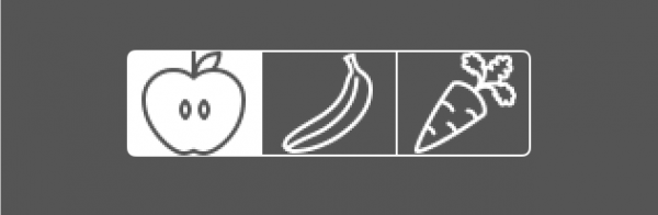
That looks much better!
Advanced Customizations
For the advanced customizations, we are going to be changing the way the segmented control draws its borders, dividers, and backgrounds.
This diagram might help explain the situation.
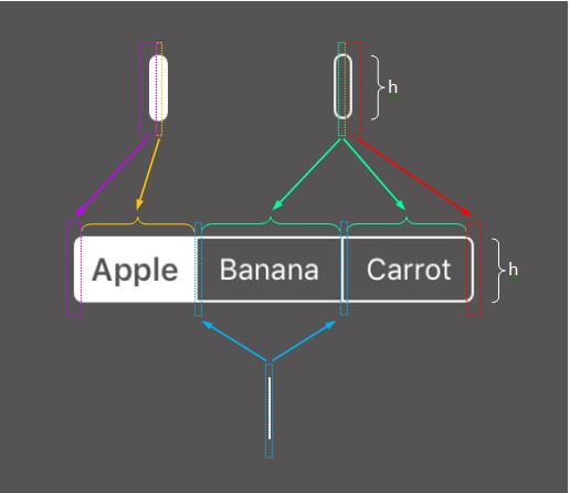
There are two methods in particular that we can use for this.
func setBackgroundImage(_:for:barMetrics:)
func setDividerImage(_:forLeftSegmentState:rightSegmentState:barMetrics:)
This could end up being quite a lot of images. For the background, you could have one image for each control state, including valid combined states such as selected and highlighted. Then for Divider images, any of those states on the left can be combined with any states on the right. In practice, we don’t need quite so many images, but you can see how this can grow out of control quickly. It would be very easy to make mistakes with a nieve implementation.
Image Factory
To get all the images were going to need for all the backgrounds and dividers in all the various states, we can create a factory. Add this code to the top of the file.
//===========================================
// MARK: SegmentedControlFactory
//===========================================
protocol SegmentedControlImageFactory {
    func background(color: UIColor) -> UIImage?
    func divider(leftColor: UIColor, rightColor: UIColor) -> UIImage?
}

extension SegmentedControlImageFactory {
    func background(color: UIColor) -> UIImage? { return nil }
    func divider(leftColor: UIColor, rightColor: UIColor) -> UIImage? { return nil }
}

struct DefaultSegmentedControlImageFactory: SegmentedControlImageFactory { }
First, we define a protocol, SegmentedControlImageFactory, that can return a background with a particular color and a divider image, given colors for the left and right sides.
Next, we extend the protocol with default implementations of each. These defaults return nil in each case which is the default value held by the UISegmentedControl.
Finally, we define a DefaultSegmentedControlImageFactory which only utilizes the default implementations. Doing so is going to allow us to add support for custom images to our builder without writing specialized code or changing the behavior for the examples we already have.
Now add these lines to the SegmentedControlBuilder right after the var section.
private let imageFactory: SegmentedControlImageFactory

init(imageFactory: SegmentedControlImageFactory = DefaultSegmentedControlImageFactory()) {
    self.imageFactory = imageFactory
}
This initializer will give us a chance to inject a custom image factory into the builder.
Let’s also define some private convenience functions. Add this code at the end of SegmentedControlBuilder.
private func color(for state: UIControlState) -> UIColor {
    switch state {
    case .selected, [.selected, .highlighted]:
        return .white
    case .highlighted:
        return UIColor.white.withAlphaComponent(0.5)
    default:
        return .clear
    }
}

private func background(for state: UIControlState) -> UIImage? {
    return imageFactory.background(color: color(for: state))
}

private func divider(leftState: UIControlState, rightState: UIControlState) -> UIImage? {
    return imageFactory.divider(leftColor: color(for: leftState), rightColor: color(for: rightState))
}
As you can see from this, we are going to be using solid white for selected or selected & highlighted states. It doesn’t make sense to combine selected with other states. For the non-selected highlighted state we will use 50% transparent white. This provides a nice in-between color which seems appropriate for the highlighted state. For any other state, we return a clear image.
You may be questioning the use of white vs. using the tint color. We are going to use this color to render a template mode image. So the color isn’t particularly important, just the alpha. Once this image is displayed on the screen, it will have the correct tint color.
We can make use of these private methods inside of the build method. Add these lines to the end of the build function.
let controlStates: [UIControlState] = [
    .normal,
    .selected,
    .highlighted,
    [.highlighted, .selected]
]
controlStates.forEach { state in
    let image = background(for: state)
    segmentedControl.setBackgroundImage(image, for: state, barMetrics: .default)

    controlStates.forEach { state2 in
        let image = divider(leftState: state, rightState: state2)
        segmentedControl.setDividerImage(image, forLeftSegmentState: state, rightSegmentState: state2, barMetrics: .default)
    }
}
First, we define the states that we should be concerned with. Note: we are ignoring disabled states here, I don’t think I’ve ever had to disable a segment but if that a requirement of yours then add it here along with states it can be combined with.
Then we loop over those states, setting the background image. For each state, we also loop through the states setting the left and right components to get the divider image. Some of these states will be redundant, left and right can’t both be selected for example, but it’s a good way not to miss any states.
Now let’s replace the SegmentedControlStackedViewsProvider with the following.
class SegmentedControlStackedViewsProvider: StackedViewsProvider {
    let items = ["Apple", "Banana", "Carrot"]

    lazy var views: [UIView] = {
        return [
            createView(imageFactory: DefaultSegmentedControlImageFactory(), items: items),
            createView(imageFactory: DefaultSegmentedControlImageFactory(), items: items.map { UIImage(named: $0)! })
        ]
    }()

    private func createView(imageFactory: SegmentedControlImageFactory, items: [String]) -> UIView {
        let builder = SegmentedControlBuilder(imageFactory: imageFactory)
        return builder.makeSegmentedControl(items: items)
    }
    private func createView(imageFactory: SegmentedControlImageFactory, items: [UIImage]) -> UIView {
        let builder = SegmentedControlBuilder(imageFactory: imageFactory)
        return builder.makeSegmentedControl(items: items)
    }
}
This code is all similar to what it was before, with the addition of defining and passing the factory through to the builder.
UIImage extension
Before we start creating these images, it’s convenient to define some functions on UIImage.
//===========================================
// MARK: UIImage extension
//===========================================
extension UIImage {
    static func render(size: CGSize, _ draw: () -> Void) -> UIImage? {
        UIGraphicsBeginImageContext(size)
        defer { UIGraphicsEndImageContext() }

        draw()

        return UIGraphicsGetImageFromCurrentImageContext()?
            .withRenderingMode(.alwaysTemplate)
    }

    static func make(size: CGSize, color: UIColor = .white) -> UIImage? {
        return render(size: size) {
            color.setFill()
            UIRectFill(CGRect(origin: .zero, size: size))
        }
    }
}
The first function, render, takes the desired canvas size and a function to draw onto the canvas. The function initializes the graphics context, calls the draw function and returns the resulting image in template rendering mode while cleaning everything up.
The second function takes merely size and color then uses the render function to create a solid color image.
Underline
So with all that setup, let’s jump into adding a customized segmented control. The underline is relatively easy and also looks nice.
//===========================================
// MARK: Underline
//===========================================
struct UnderlinedSegmentedControlImageFactory: SegmentedControlImageFactory {
    var size = CGSize(width: 2, height: 29)
    var lineWidth: CGFloat = 2

    func background(color: UIColor) -> UIImage? {
        return UIImage.render(size: size) {
            color.setFill()
            UIRectFill(CGRect(x: 0, y: size.height-lineWidth, width: size.width, height: lineWidth))
        }
    }

    func divider(leftColor: UIColor, rightColor: UIColor) -> UIImage? {
        return UIImage.render(size: size) {
            UIColor.clear.setFill()
        }
    }
}
The background image is just a clear image 29 pixels in height with a line at the bottom. Remember, this image defines the height of the control. That’s why it needs to be 29 pixels rather than 2.
The divider image is merely a clear image. It almost seems like you could just return nil but that will only give you the default divider. So, to get the desired result, we need to create an invisible image.
To view the result, add this line to the list of views in SegmentedControlStackedViewsProvider.
createView(imageFactory: UnderlinedSegmentedControlImageFactory(), items: items)
Now you should see a new segmented control which has an underline under the selected segment. The underline is rather straightforward, but you should start to get a good idea of how the backgrounds and dividers work.
Pill
The pill shape is a bit more complicated for a couple of reasons. Let’s start by looking at the image factory.
//===========================================
// MARK: Pill
//===========================================
struct PillSegmentedControlImageFactory: SegmentedControlImageFactory {
    var size = CGSize(width: 32, height: 32)

    func background(color: UIColor) -> UIImage? {
        return UIImage.render(size: size) {
            color.setFill()
            let rect = CGRect(origin: .zero, size: size)
            UIBezierPath(roundedRect: rect, cornerRadius: size.height/2)
                .fill()
        }
    }

    func divider(leftColor: UIColor, rightColor: UIColor) -> UIImage? {
        return UIImage.render(size: size) {
            let radius = size.height/2

            leftColor.setFill()
            UIBezierPath(arcCenter: CGPoint(x: 0, y: radius), radius: radius, startAngle: CGFloat.pi/2, endAngle: -CGFloat.pi/2, clockwise: false)
                .fill()

            rightColor.setFill()
            UIBezierPath(arcCenter: CGPoint(x: size.width, y: radius), radius: radius, startAngle: CGFloat.pi/2, endAngle: -CGFloat.pi/2, clockwise: true)
                .fill()
        }
    }
}
The size now is 32×32. An equal width and height allow for drawing a circle. For the background image, we simply draw a circle that fits the size. When the control renders the background, it will stretch the middle pixel to fill space required for the content and therefore creating a pill shape.
For the divider image, we draw two half circles. The left half circle acts as a cap for the pill to the left, and the right half circle acts as a cap for the pill to the right.
Let’s take a look at the result. Add this line to the list of views in SegmentedControlStackedViewsProvider.
createView(imageFactory: PillSegmentedControlImageFactory(), items: items),
You should see the pill over the selected item. Something’s not quite right. The pill and text are not center aligned with one another. Try tapping on the second item; this one seems correct. Finally, tap on the last item. You’ll notice that this one is misaligned in the opposite direction of the first item. So how can we fix that?
Position Adjustment
The UISegmentedControl has a method setContentPositionAdjustment which does just that. For us to use this in a general way let’s do a little setup.
// add to protocol SegmentedControlImageFactory
var edgeOffset: CGFloat { get }

// add to protocol extension
var edgeOffset: CGFloat { return 0 }

// add to PillSegmentedControlImageFactory
let edgeOffset: CGFloat = 8
With an edgeOffset parameter, our custom image factories can provide the offsets that are required. This might seem a bit strange to have the image factory tell us how to offset the text, but the intent of the images returned by the image factory can only be known by that object.
Now let’s add some code to SegmentedControlBuilder to make use of this offset. Add this private convenience function.
private func positionAdjustment(forSegmentType type: UISegmentedControlSegment) -> UIOffset {
    switch type {
    case .left:
        return UIOffset(horizontal: imageFactory.edgeOffset, vertical: 0)
    case .right:
        return UIOffset(horizontal: -imageFactory.edgeOffset, vertical: 0)
    default:
        return UIOffset(horizontal: 0, vertical: 0)
    }
}
This just switches on the segment type and provides a positive offset for the left item and a negative offset for the right item. This will correct what we saw earlier. Apple was too far left and needed a positive horizontal offset while Carrot was too far right.
Now let’s make use of this function. Add this code to the end of the build(segmentedControl:) method.
[.left, .right]
    .forEach { (type: UISegmentedControlSegment) in
        let offset = positionAdjustment(forSegmentType: type)
        segmentedControl.setContentPositionAdjustment(offset, forSegmentType: type, barMetrics: .default)
}
Sweet! Our text and pills are now drawing the way we want.
This looks pretty good until you start clicking around a little bit. You might notice some undesirable animation artifacts. The animation for the background is different than the animation for the dividers resulting in a glitchy feeling.
Odd animation behavior
The animation is, for the most part, out of our control. One thing that we can try to do is remove the undesired animation. The animation happens so fast that you probably wouldn’t even notice it if it weren’t for the fact that it doesn’t line up with the dividers.
Since our builder is ephemeral, let’s create a singleton class that can remove the animations.
class SegmentedControlAnimationRemover {
    static var shared = SegmentedControlAnimationRemover()
    @objc func removeAnimation(_ control: UISegmentedControl) {
        control.layer.sublayers?.forEach { $0.removeAllAnimations() }
    }
}
By making this a class and exposing the removeAnimation function to objc, we can add it as a target to any or all segmented controls. Given a control, we iterate over the sublayers and remove all animations.
Now to make use of this, add this line to the end of build(segmentedControl:).
segmentedControl.addTarget(SegmentedControlAnimationRemover.shared, action: #selector(SegmentedControlAnimationRemover.removeAnimation(_:)), for: .valueChanged)
Now, whenever the control’s value changed action is triggered (i.e., when selecting a new segment), the removeAnimations method will be called.
The results are much better! I have noticed that this doesn’t seem to be 100%, but it’s passable. If you have any ideas about improving this, I’d love to hear about it.
Let’s do one more!
Tabs
The tabs style uses everything we’ve done so far. Because of our architecture, we only need to create a custom segmented control image factory.
Here’s the code for the image factory.
//===========================================
// MARK: Tab
//===========================================
struct TabSegmentedControlImageFactory: SegmentedControlImageFactory {
    let edgeOffset: CGFloat = 4
    func background(color: UIColor) -> UIImage? {
        let size = CGSize(width: 32, height: 29)

        return UIImage.render(size: size) {
            UIColor.white.setFill()
            let path = UIBezierPath()
            path.move(to: CGPoint(x: size.width, y: size.height))
            path.addLine(to: CGPoint(x: size.width*0.75, y: 0))
            path.addLine(to: CGPoint(x: size.width*0.25, y: 0))
            path.addLine(to: CGPoint(x: 0, y: size.height))

            path.lineWidth = 1.0
            path.stroke()

            path.close()
            color.setFill()
            path.fill()
        }
    }

    func divider(leftColor: UIColor, rightColor: UIColor) -> UIImage? {
        let size = CGSize(width: 32*0.25, height: 29)
        return UIImage.render(size: size) {
            let leftPath = UIBezierPath()
            leftPath.move(to: .zero)
            leftPath.addLine(to: CGPoint(x: size.width, y: size.height))
            leftPath.addLine(to: CGPoint(x: 0, y: size.height))
            leftPath.close()
            leftColor.setFill()
            leftPath.fill()

            let rightPath = UIBezierPath()
            rightPath.move(to: .zero)
            rightPath.addLine(to: CGPoint(x: size.width, y: 0))
            rightPath.addLine(to: CGPoint(x: size.width, y: size.height))
            rightPath.close()
            rightColor.setFill()
            rightPath.fill()

            UIColor.white.setFill()
            let path = UIBezierPath()
            path.move(to: .zero)
            path.addLine(to: CGPoint(x: 0, y: 0))
            path.addLine(to: CGPoint(x: size.width, y: size.height))
            path.lineWidth = 1.0
            path.stroke()
        }
    }
}
I won’t talk too much about how this code works. As before we create a background image and divider images. One difference is that the background and divider images are different widths. The width of the divider is one-quarter of the background. The important thing here is that the size needs to divide evenly. Otherwise, you might see a pixel gap.
Now we can test the new segmented control by adding to our list of views in SegmentedControlStackedViewsProvider.
createView(imageFactory: TabSegmentedControlImageFactory(), items: items)
Conclusion
We covered a lot in this post. From simple toggles to fully custom images and even looked at some issues that come up along the way. We created a total of five different styles of segmented controls. More importantly, we built out a nice architecture to easily change our options or inject new ones.
Remember, you can also use UISegmentedControl.appearance() to automatically apply a style to all of the segmented controls in your app.
Here’s the final project if you would like to download it – SegmentedControl.playground
I’d love to hear your feedback, questions or thoughts; find me on twitter @kenboreham
Thanks for reading! 🔥👍
builder patterncreatecustomdraw codefactory patternsegmented controlUIImageUIKitUISegmentedControl
 Ken Boreham
How to customize UISegmentedControl without losing your mind
March 25, 2018
Playground, UIKit
Comments Off on How to customize UISegmentedControl without losing your mind
Ken Boreham
The UISegmentedControl provided by UIKit is a ubiquitous control. However, when it comes to customizing this control, it can get pretty tricky. So I’m going to try to explain how this widget can be styled to better match your app by walking through a few different customizations.
The image below shows the different styles we will build.
Setup
Let’s start by setting up a swift playground. Since we’re going to be creating and comparing multiple UISegmentedControls, I’m thinking a view controller with a stack view will be great for handling the layout.
StackViewController will be a simple view controller. All we are going to do is set a background color and set up a stack view. The stack view provides an easy way to automatically stack the example controls with adequate spacing.
The goal now is to inject the UISegmentedControl views that we are going to be testing. Let’s define a protocol StackedViewsProvider that can provide these view.
The protocol only contains one variable, an array of views that the stack view will use.
Next, we create a class that conforms to the protocol and will create UISegmentedControl views. Here the views var is marked lazy. In this way, we can defer creation until the StackedViewController needs them.
The private function does the actual work of creating the first segmented control. This one is just the very basic segmented control with a white tint color, and we programmatically set the first item to be selected. You will usually want to set the tint color to match the design of the app. Also, setting a selected segment index to start with is often a good idea unless you intend for the elements to act as buttons (you can use the isMomentary member variable for that).
We still need to inject this into the StackedViewController. Add these lines to the top of the controller.
First, we create a member variable to hold the stackedViewsProvider. Then create an initializer to inject it.
Now that we created a custom initializer, we must also implement the required initializer. However, since we will not be using it, we can just error here.
Now we need to use this new initializer. At the bottom of the file where the controller is created, replace that line with these two.
Finally, let’s use these view in the stack view. Replace the line where the stack view is created with this:
You should now see your first UISegmentedControl!
Simple customizations
We have already done the most basic customizations: setting tint color and setting selected index. I have also previously mentioned that you can make the segments act as buttons with the isMomentary flag.
Width
Another useful flag is apportionsSegmentWidthsByContent. Normally, all of the segments in the segmentedControl are equal in width. That may be a good default behavior, especially when constraining the leading trailing edges of the segmented control to its super view. However, it can be desirable to have the segments have a tighter fit around their contents. To get that behavior, we can just set apportionsSegmentWidthsByContent = true. It is also worth noting that it is possible to set a per segment width.
At the bottom of createView(items:) but before the return, add this line:
Font
Another nice feature is to set the selected segment’s title to be bold and a little more substantial. For example:
This will set the title to have the preferred font for headline style when the segment is selected. This makes the selected item stand out even more. This might be a little much, in some cases just bold system font might be more appropriate.
This also has the side effect of animating between bold and regular text when a segment is selected and highlighted. In other words, if you select a segment (tap it) and the also highlight it (press and hold) you will see it animate. Normally this would not happen. This would be nice feedback to the user if you were going to refresh or do some action when the segment is pressed.
This effect may be undesirable, however. In that case, you might expect that you can assign the font to the [.selected, .highlighted] control state. Unfortunately, that does not work here. 😓 However, we are not lost just yet. We can add the font to the .highlighted control state, and that does work. Of course, that also adds that font to all .highlighted segments which is kind of nice.
At the bottom of createView(items:) but before the return, add these lines:
Builder
We have several options now that can be applied to our segmented controls. Usually, within a single application, you will want to pick some defaults and stick with it. We will not want to copy and paste all that setup. The containing view or view controller probably doesn’t care much about these details either. Therefore, it should make sense to extract these things into a separate builder class. Add the following code to the top of the file.
This struct holds some member variables that can be used to customize the segmented control. The first two variables are related to the font customization. I chose to use the “bold” font for .selected and .highlighted control states, but you can change these defaults to fit your preference. The tintColor property can be chosen to fit the theme of the app and apportionsSegmentWidthsByContent can be set based on the intended layout. Since the content in this demo is centered, I chose to set this to true.
Now we can use this builder by replacing the createView method in our StackedViewsProvider.
At this point, it doesn’t seem like we’ve done a whole lot of customizing. Toggling a few properties might seem like no big deal. But, what we have done is a start to build up a base that we can add customizations to. This SegmentedControlBuilder is going to help a lot in the long run and keep the code sane.
Icons
Before we start digging into the more advanced customizations, let’s take a look at icons. Icons can dramatically change the feel of the control with little effort. So far we have used Strings to define our segment titles. You might have noticed that the UISegmentedControl initializer takes an array of Any. The documentation says that we can pass an array of either String of UIImage.
First, let’s add some images to the resources. I grabbed these from icons8.com.
Now we need to update our API to allow images. Let’s start with the Builder. Replace the makeSegmentedControl method with the following.
We keep the type safety of our API for making new segmented controls by adding an overload that takes an array of UIImage elements. Then we pass that segmented control to the build function. This build function remains a public API so we can build up any already created segmented controls. This is especially useful if you want all your controls to look the same way; you can pass the appearance proxy to the build function.
To use this in the demo app, we need to add a similar overload in UISegmentedControlStackedViewsProvider.
Then we just need to add a call to our views array.
The items [“Apple”, “Banana”, “Carrot”] are mapped into UIImage assets with the same name. Make sure you added those assets and that they are named correctly.
You should see something like the image above. Unfortunately, that’s not quite right; the icons are squashed! This doesn’t just work as you would expect. In fact, some of the normal solutions don’t quite work either. For example, setting the frame’s height doesn’t work, and there are no segment height parameters like there is for width. Luckily, there is one thing that works, auto layout constraints.
Replace the image array overload for the builders makeSegmentedControl(item:) method.
That looks much better!
Advanced Customizations
For the advanced customizations, we are going to be changing the way the segmented control draws its borders, dividers, and backgrounds.
This diagram might help explain the situation.
There are two methods in particular that we can use for this.
This could end up being quite a lot of images. For the background, you could have one image for each control state, including valid combined states such as selected and highlighted. Then for Divider images, any of those states on the left can be combined with any states on the right. In practice, we don’t need quite so many images, but you can see how this can grow out of control quickly. It would be very easy to make mistakes with a nieve implementation.
Image Factory
To get all the images were going to need for all the backgrounds and dividers in all the various states, we can create a factory. Add this code to the top of the file.
First, we define a protocol, SegmentedControlImageFactory, that can return a background with a particular color and a divider image, given colors for the left and right sides.
Next, we extend the protocol with default implementations of each. These defaults return nil in each case which is the default value held by the UISegmentedControl.
Finally, we define a DefaultSegmentedControlImageFactory which only utilizes the default implementations. Doing so is going to allow us to add support for custom images to our builder without writing specialized code or changing the behavior for the examples we already have.
Now add these lines to the SegmentedControlBuilder right after the var section.
This initializer will give us a chance to inject a custom image factory into the builder.
Let’s also define some private convenience functions. Add this code at the end of SegmentedControlBuilder.
As you can see from this, we are going to be using solid white for selected or selected & highlighted states. It doesn’t make sense to combine selected with other states. For the non-selected highlighted state we will use 50% transparent white. This provides a nice in-between color which seems appropriate for the highlighted state. For any other state, we return a clear image.
You may be questioning the use of white vs. using the tint color. We are going to use this color to render a template mode image. So the color isn’t particularly important, just the alpha. Once this image is displayed on the screen, it will have the correct tint color.
We can make use of these private methods inside of the build method. Add these lines to the end of the build function.
First, we define the states that we should be concerned with. Note: we are ignoring disabled states here, I don’t think I’ve ever had to disable a segment but if that a requirement of yours then add it here along with states it can be combined with.
Then we loop over those states, setting the background image. For each state, we also loop through the states setting the left and right components to get the divider image. Some of these states will be redundant, left and right can’t both be selected for example, but it’s a good way not to miss any states.
Now let’s replace the SegmentedControlStackedViewsProvider with the following.
This code is all similar to what it was before, with the addition of defining and passing the factory through to the builder.
UIImage extension
Before we start creating these images, it’s convenient to define some functions on UIImage.
The first function, render, takes the desired canvas size and a function to draw onto the canvas. The function initializes the graphics context, calls the draw function and returns the resulting image in template rendering mode while cleaning everything up.
The second function takes merely size and color then uses the render function to create a solid color image.
Underline
So with all that setup, let’s jump into adding a customized segmented control. The underline is relatively easy and also looks nice.
The background image is just a clear image 29 pixels in height with a line at the bottom. Remember, this image defines the height of the control. That’s why it needs to be 29 pixels rather than 2.
The divider image is merely a clear image. It almost seems like you could just return nil but that will only give you the default divider. So, to get the desired result, we need to create an invisible image.
To view the result, add this line to the list of views in SegmentedControlStackedViewsProvider.
Now you should see a new segmented control which has an underline under the selected segment. The underline is rather straightforward, but you should start to get a good idea of how the backgrounds and dividers work.
Pill
The pill shape is a bit more complicated for a couple of reasons. Let’s start by looking at the image factory.
The size now is 32×32. An equal width and height allow for drawing a circle. For the background image, we simply draw a circle that fits the size. When the control renders the background, it will stretch the middle pixel to fill space required for the content and therefore creating a pill shape.
For the divider image, we draw two half circles. The left half circle acts as a cap for the pill to the left, and the right half circle acts as a cap for the pill to the right.
Let’s take a look at the result. Add this line to the list of views in SegmentedControlStackedViewsProvider.
You should see the pill over the selected item. Something’s not quite right. The pill and text are not center aligned with one another. Try tapping on the second item; this one seems correct. Finally, tap on the last item. You’ll notice that this one is misaligned in the opposite direction of the first item. So how can we fix that?
Position Adjustment
The UISegmentedControl has a method setContentPositionAdjustment which does just that. For us to use this in a general way let’s do a little setup.
With an edgeOffset parameter, our custom image factories can provide the offsets that are required. This might seem a bit strange to have the image factory tell us how to offset the text, but the intent of the images returned by the image factory can only be known by that object.
Now let’s add some code to SegmentedControlBuilder to make use of this offset. Add this private convenience function.
This just switches on the segment type and provides a positive offset for the left item and a negative offset for the right item. This will correct what we saw earlier. Apple was too far left and needed a positive horizontal offset while Carrot was too far right.
Now let’s make use of this function. Add this code to the end of the build(segmentedControl:) method.
Sweet! Our text and pills are now drawing the way we want.
This looks pretty good until you start clicking around a little bit. You might notice some undesirable animation artifacts. The animation for the background is different than the animation for the dividers resulting in a glitchy feeling.
Odd animation behavior
The animation is, for the most part, out of our control. One thing that we can try to do is remove the undesired animation. The animation happens so fast that you probably wouldn’t even notice it if it weren’t for the fact that it doesn’t line up with the dividers.
Since our builder is ephemeral, let’s create a singleton class that can remove the animations.
By making this a class and exposing the removeAnimation function to objc, we can add it as a target to any or all segmented controls. Given a control, we iterate over the sublayers and remove all animations.
Now to make use of this, add this line to the end of build(segmentedControl:).
Now, whenever the control’s value changed action is triggered (i.e., when selecting a new segment), the removeAnimations method will be called.
The results are much better! I have noticed that this doesn’t seem to be 100%, but it’s passable. If you have any ideas about improving this, I’d love to hear about it.
Let’s do one more!
Tabs
The tabs style uses everything we’ve done so far. Because of our architecture, we only need to create a custom segmented control image factory.
Here’s the code for the image factory.
I won’t talk too much about how this code works. As before we create a background image and divider images. One difference is that the background and divider images are different widths. The width of the divider is one-quarter of the background. The important thing here is that the size needs to divide evenly. Otherwise, you might see a pixel gap.
Now we can test the new segmented control by adding to our list of views in SegmentedControlStackedViewsProvider.
Conclusion
We covered a lot in this post. From simple toggles to fully custom images and even looked at some issues that come up along the way. We created a total of five different styles of segmented controls. More importantly, we built out a nice architecture to easily change our options or inject new ones.
Remember, you can also use UISegmentedControl.appearance() to automatically apply a style to all of the segmented controls in your app.
Here’s the final project if you would like to download it – SegmentedControl.playground
I’d love to hear your feedback, questions or thoughts; find me on twitter @kenboreham
Thanks for reading! 🔥👍
Share this:
builder patterncreatecustomdraw codefactory patternsegmented controlUIImageUIKitUISegmentedControl